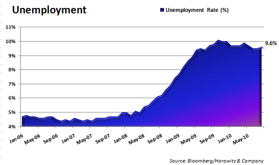
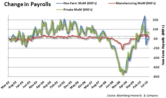
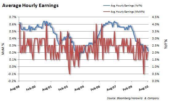
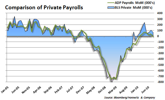
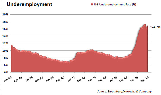
Here they are…. The Charts of the day – Unemployment, sliced and diced. What does this show us?
Well, there were low expectation for anything good out of the private sector. That is one reason that pushed up U.S. markets intiially. But, underlying some of the headlines, there is still a great deal to be concerned about.
We had expected a loss totaling 125,000 – we were obviously too high.
From Ransquawk:
Two of the three largest growth categories in payrolls were a 28k increase in health care workers and a 17k increase in temporary office workers. So the initial euphoria post better than expected reading, together with weaker ISM may see a reversal in risk appetite. Also, among the marginally attached, there were 1.1 million discouraged workers in August, an increase of 352,000 from a year earlier.


