
This is a great tool to help better find which sector is gaining momentum and those that are losing steam. We are tracking 12 weeks of returns for the core S&P sectors.
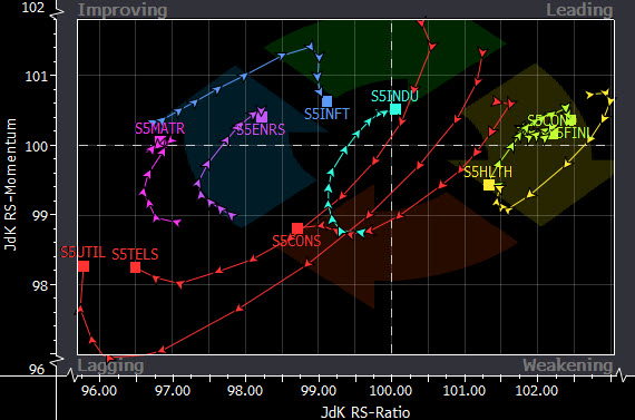
This chart correlates well with the earnings results thus far for the quarter. Notice that tech had been gaining strength and then fell off over the past couple of weeks. Health Care, Financials and Consumer Discretionary have been the winners…
According to Bloomberg:
RRG allows you to visualize the relative strength of a universe of securities or a portfolio against an index or a benchmark so you can identify market areas of interest to explore further. RRG uses proprietary indicators to plot the relative strength and the direction of a set of securities. RRG clearly displays trend strength and direction, making it useful for generating pair-trading ideas.
The RS-ratio, which measures strength, appears on the x-axis. The RS-momentum, which measures the direction and pace of the RS-ratio line, appears on the y-axis. The chart is divided into four quadrants ( Improving, Leading, Weakening, and Lagging ) that give you perspective on the strength of the charted securities relative to one another as they move between quadrants. You have the option of connecting the datapoints for each security, which makes it easier to see the security’s progress from one quadrant to another.
RS-Ratio – A uniform measure of relative strength, which enables the comparison of all elements in a universe with each other. The higher the number, the stronger the relative strength; the lower the number, the weaker the relative strength.
RS – Momentum – A uniform measure of the direction and the pace of the RS-ratio line. This gives an indication of the rate of change of the RS-ratio line.