From the Chart in Focus newsletter from Tom McClellan, I thought that this would be rather timely. Whether or not this indication actual holds any real predictive power is up for grabs, but since there has been so much chatter about it, I thought it would be good get some clarification from Tom.
(Sign up for this newsletter at the end of the article)

June 06, 2013
The following article appeared in the June 5 issue of our twice monthly newsletter. If you are not currently subscribed to receive that publication, then this is the type of information you are missing out on. You can see samples and sign up here. There is additional commentary added at the end of this article to extend the point.
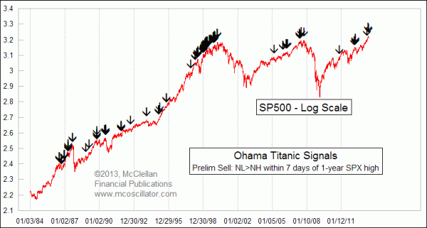
There are two market warning signs which have just recently been triggered and which have gotten a lot of press attention due to their catchy names. The Titanic Syndrome was created in 1965 by the late Bill Ohama. It gives a “preliminary sell signal” anytime that the number of 52-week New Lows (NL) exceeds New Highs (NH) on the NYSE within 7 trading days before or after a major market high.
The top chart shows all of the instances since 1984 of these preliminary sell signals firing off. You can see that they do tend to cluster around major tops, but they also seem to cry “wolf” a lot at other times when an uptrend continues. Ohama noticed that too, and so he added further criteria to constitute what he called “additional evidence”. He wanted to see NL exceed NH for 4 out of 5 days, plus NH declining to less than 1.5% of total issues, and finally to have the DJIA (or SP500) decline for 4 out of 5 days. We now have 2 out of those 3 criteria met, but have not seen the DJIA or SP500 drop for 4 of 5 days.
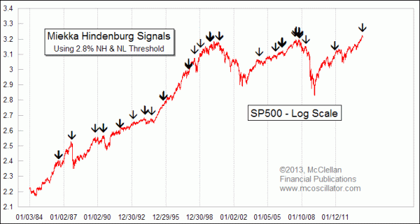
In 1995, mathematician and market analyst Jim Miekka created a similarly ominous signal that came to be known as the Hindenburg Omen. It too looks at NH and NL, and was an adaptation of Gerald Appel‘s “Split Market Sell Signal”. Appels signal was simply a case of seeing both NH and NL exceed 45, with no adjustment for changes in the number of issues traded. Miekka refined it by adding a few additional rules to get a more quantified signal.

Initially, Miekka set a threshold that both NH and NL had to exceed 2.2% of total NYSE issues on the same day. He later adjusted that up to 2.8% of Advances plus Declines after decimalization changed the way that issues traded, and reduced the number of unchanged issues each day. In addition, the NYSE Comp has to be above its value of 50 trading days ago, and the McClellan Oscillator has to be negative.
You may see web sites that list different criteria, based on Miekka‘s earlier writings. The criteria I use are as Miekka himself reported to Greg Morris for Morris‘ 2006 book, The Complete Guide to Market Breadth Indicators. Using the original 2.2% threshold, there have been 4 Hindenburg Omen signals between May 29 and June 4, 2013. Using the more up to date 2.8% threshold, there have been only 2, but that is still a significant alert to get our attention. For more on the calculations and the differences in criteria, see this 2010 article.
The way that the Hindenburg Omen got its name is a bit of an interesting story. Miekka brought his idea for this signal to our friend the late Kennedy Gammage, who wrote The Richland Report newsletter and who was a big fan of the McClellan Oscillator. Gammage had worked in advertising earlier in life, and knew the importance of good branding. He had also been aware of Ohama’s Titanic Syndrome signal, and so he suggested the Hindenburg Omen name to Miekka. The word “omen” is an important one; it is a warning, not a guarantee of trouble.
The logic of why it would be important to have NH and NL both at a high level at the same time is that it can be a sign of rotation of leadership, and that can be a topping indication. It does not have to be one, but it can.
Like the Titanic Syndrome, the Hindenburg Omen does give signals at some times that are not as important as others. But what is important is that it has not failed to fire off a signal ahead of all of the major price declines of the past 30 years. So if one can live with a signal that cries “wolf” some of the time, then it can be a useful message to receive. It is especially useful when it gives a signal more than once within just a few days.
John Bollinger, who created Bollinger Bands, has a good way of describing both of these indications. Rather than thinking of them as “signals”, it is perhaps better to think of them as “alerts”. Each can be useful for getting one to pay more attention to bearish signs in other charts and indicators, even as one retains the knowledge that it could turn out not to lead to a big selloff every time.
And the attention that each has gotten lately from the financial media is great proof that a cataclysmic sounding brand name is better for getting attention.
ADDITIONAL COMMENT
In addition to the above text which appeared in our newsletter, there are a few more points worthy of comment. One is that there have been a lot of news stories lately about the Hindenburg Omen. A search of Google News items for the exact phrase “Hindenburg Omen” reveals no less than 4,800 items recently. That’s news items, not total items. Some are duplicates, and a whole lot of them cite the incorrect criteria listed on Wikipedia for what qualifies as a Hindenburg Omen. It’s too bad that getting the right information is not held up as a loftier goal.
Among the recent criticisms this time is that a lot of the stocks which are making up the New Lows list are not “real” stocks. Instead they are the looked down upon subclass of NYSE-listed issues which are presumed to be not as important. This presumption is an unfortunate piece of analytical bigotry. If an indication comes from bond closed end funds (CEFs), or from preferred stocks, rights, warrants, and other items, some people believe that it cannot possibly be as valid as if “real” stocks gave such a signal.
Here is the problem with such thinking: it is presumptive, and not the result of investigation. The belief that data on common stocks is better than data on other issues is an unproven hypothesis, but this does not seem to bother some people. That should be a lesson right there about which analysts to listen to.
Interestingly, this dismissal of NYSE breadth data due to being “contaminated” by interest rate sensitive issues has been around almost as long as the A-D Line has been used. Analysts started paying more attention to A-D data in the early 1960s, after Richard Russell and Joe Granville made note of how it had shown a big divergence from prices ahead of the DJIA’s 27% decline in 1962. Russell once related to me that people back in the 1960s criticized the A-D Line because a lot of the issues on the NYSE were insurance and utility companies whose price movements were presumed to be governed by interest rates, and which were therefore deemed to be suspect. But that has not stopped the A-D Line from being a great indicator, when interpreted correctly.
We hear the same dismissive comments being made today about preferred stocks and bond CEFs, almost always by people who have not actually looked at the data.
My own findings show that it is often the “uncommon” issues which are more worthy of listening to. That is counterintuitive, but it is what the data lead me to conclude. Closed end bond funds are especially sensitive to liquidity problems, and so if a liquidity problem is developing it will often show up among the bond CEFs first.

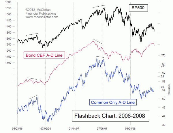
We saw a great example of this back in 2006 and 2007. The bond CEF A-D Line showed problems well ahead of the “common only” version as well as the composite NYSE A-D Line. So if one’s purpose is to look for a leading indication of liquidity problems, it seems that the bond CEFs are a great indicator, rather than being the contaminator of A-D data that so many people believe them to be. It is worth noting that just recently, the bond CEF A-D Line peaked on May 8, 2013 and turned down sharply several days ahead of the stock market’s May 28, 2013 peak. That was a nice warning to see, and to be able to share with my Daily Edition subscribers.
Putting it more bluntly, for someone to dismiss the “uncommon” issues as being less worthy of listening to is a bigoted position, and it is unjustified given the actual way that data behave. It is a conclusion which comes from prejudging the data without looking at it. Doing that about data, as with doing that about people, is prejudicial and not appropriate.
Tom McClellan
Editor, The McClellan Market Report
www.mcoscillator.com
 (253) 581-4889


