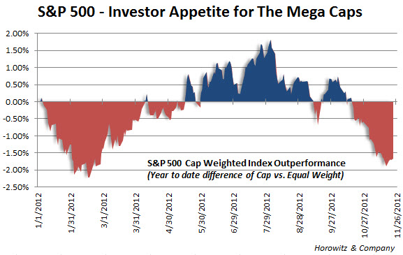
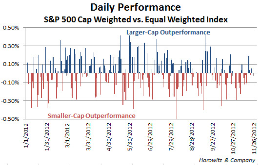
Just an interesting look at how investors are behaving with respect to their choice of cap size during the year. The first chart displays the performance spread between the S&P 500 index, which is capitalization weighted to the same index with an equal weighting of all constituents.
Basically, when the line is below zero and red, the mega-caps are probably dragging down performance. That makes sense as we have seen Apple (AAPL) and Google (GOOG) lagging big time recently and that shows up clearly over the past few months.
In a sense, this really shows the risk on/off trade as investors will often buy up the smaller and more volatile stocks during a strong uptrend – though that is not always the case.


