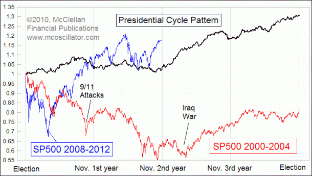
A listener of the TDI podcast asked for some clarification on the presidential cycles. I asked Tom McClellan for his thoughts:
I think that the attached chart will suit your purposes. I had it already prepared for a different use, and figured that it might offer some interesting insights to your followers.
Check out Tom’s site HERE for more great charts like this…
The current period of Obama’s first term is shown in blue (appropriately). For comparison, I also included the SP500’s behavior during Bush’s first term (in red). Back then, the market got knocked down by a couple of exogenous events, namely the 9/11 attacks, and the buildup to the war with Iraq. It is easy to see how those events bent the price plot, even as the SP500 correlated generally to the Presidential Cycle Pattern.
The current market pattern seems to be getting an early jump on the typically bullish 3rd year.


