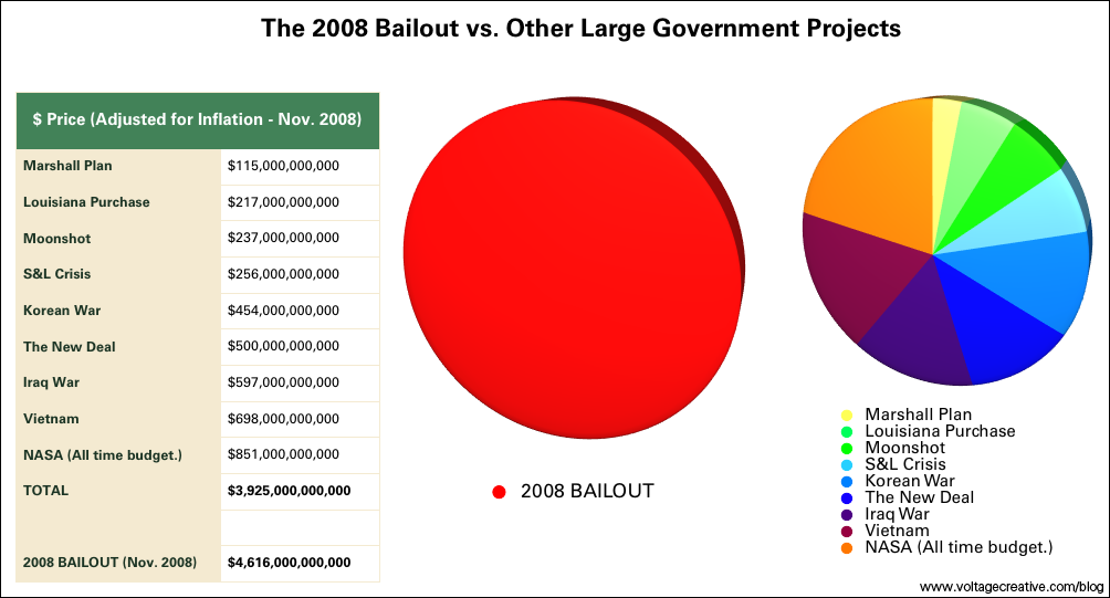
I originally found this colorful yet sobering chart over at Infectious Greed a day ago. He clipped it from Voltage Creative and even as there are ongoing and heated arguments over the total taxpayer money that has been committed to save the system, all agree it is a monstrous number.
The dollars in the chart have been adjusted for inflation and the comparatives are simply included to provide a vantage point to absorb the magnitude of the money that has been thrown at this mess.
Note: Bloomberg has the tally closer to $7,150,000,000,000 (rounded to closest billion)
Chart was origianlly created by Voltage Creative. Nice Work!


