Focus on the recent employment trends will have a large impact on the way constituents vote in the upcoming presidential election. President Obama’s term has taken quite a bit of heat lately as questions have arisen to “are we better off now?”. With the employment numbers coming out this week, let’s take a look at what we are seeing:
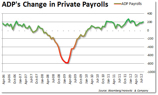
ADP’s Private Payrolls continue to shock and awe markets with numbers better than expectations. Just this week on Wednesday, we witnessed a rise in private payrolls of 201,000 vs. expectations of only 140,000. The previous number that was released in July was revised higher as well by 10,000 new payrolls after a “recount”. The trend for ADP has been quite consistent with new payrolls averaging between 150,000 – 175,000 per month.
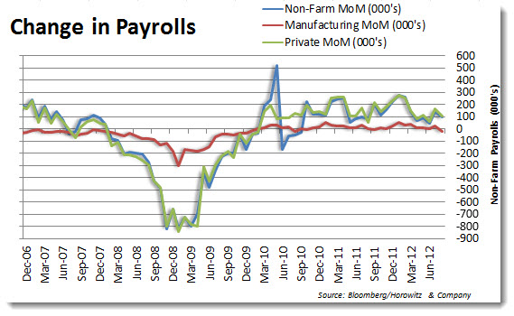
Contrary to ADP, the Non-Farm Payrolls released by the Bureau of Labor Statistics continues to disappoint which allows QE3 or other stimulus to remain in the FEDs bag of tricks.
- Non-Farm Payrolls came in at 96,000 vs. expectations of 130,000
- Private Payrolls were at 103,000 vs. expectations of 142,000
- Manufacturing Payrolls were the most disappointing at -15,000 vs. expectations of 10,000
- Revisions were made to all three payrolls numbers with all being revised down on average of around 10,000
While the trend for payroll creation remains positive, it is far less than anyone had expected this far into the “economic recovery”.
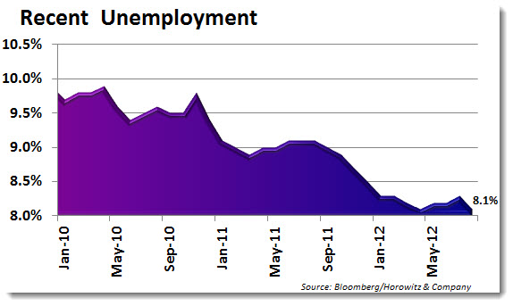
The unemployment rate dropped down to 8.1% vs. expectations of 8.3% which at face value is very impressive. However, much discussion has been given to the statistical nature of this drop as many people have dropped out of the workforce due to disappointment. The recent trend in the unemployment rate has been impressive, but it is really all about the time period that we are looking at.
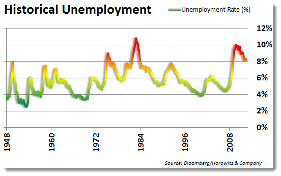
Longer term does not look as good as we are still at one of the higher points in history.


