I know, we have all been so happy and full of optimism over the initial and continuing claims that we forgot to look at the fine print. But, who really needs to look at the details when the markets are moving in one direction regardless of the facts.
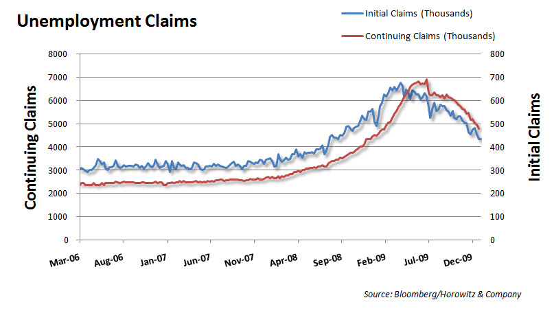
So, I thought it would be a good idea to look a little further into the details of the continuing claims to see just how good the data was coming along. So, the first chart is the one that we usually see for the weekly continuing claims.
 The chart looks like less people are collecting benefits and therefore we may be seeing some hiring. At least that is the way some would like it interpreted.
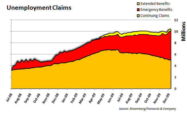
Below is the chart that shows all of the continuing claims inclusive of the basic benefits, the extended benefits and the emergency benefits. See the difference?
 Hmmmm. I wonder if someone will actually provide the data to have this announced along side of the weekly claims data on Thursdays. Maybe I will mail this to Steve Liesman over at CNBC, he will appreciate this. Ok, just emailed…
Thoughts? Comments?


