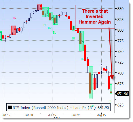
As we saw earlier in the week with the S&P 500, the Inverted Hammer candle is one to be aware of. This is but one of those negative indications that show the overall forces behind the market activity. (Note that the post we ran was mid-day and the pattern actually turned into a Doji by the end of the day)
But, what we need to know from looking at this chart is that if buyers were in command, then we would have seen the day’s candle maintain toward the upper half of the range. Instead, buyers came in only to find that every time they tried to push, they were met with selling pressure.

There are many patterns to be aware of, some bullish, some bearish and others neutral. I would suggest that the best way to use these in in coordination with other data that presents a broad picture of what is occurring.
If you want more of an education in chart interpretation, make sure to check out AfraidtoTrade.com – Corey is wonderful at this stuff.


